Tail Scale
"Our p99 is fine" and "one user in six has a bad time" are the same sentence. We rarely hear it that way, and in this post I wanted to go through why that can be.
tail-scale is a small browser tool, a toy, for visualizing the tail-at-scale effect: the way a rare slow call stops being rare once a web page, a phone screen, or a service waits on enough of them. It's a single standalone HTML file running an in-browser Monte-Carlo simulation of serial and parallel fanout effects. You can download the page, open it in a browser and use the sliders to watch how good-put and bad-put numbers adjust. The model itself is captured in some reference python code that the web page is derived from.
The idea isn't mine, far from it. In 2013, Dean and Barroso named it in their paper, The Tail at Scale. In 2021, Marc Brooker laid out the bimodal model in a startlingly brief and imo classic blog post, Tail Latency Might Matter More Than You Think. Both put us in an uncomfortable place: a system can run inside its percentile and service level targets, while a real share of its clients have a slow time in the aggregate. So credit where credit is due. Marc Brooker's is the bimodal model tail-scale uses, more or less unchanged. Dean and Barroso's paper is where the effect was named and where the hundred fan-out backend figure comes from that makes our 18 and 40 wide fan-outs we’ll see in the examples seem a bit less wild. I can’t recommend reading them enough.
Math will tear us apart again
Give every service call in our system a w chance of breaking a latency boundary. So, a p99 call is w = 0.01 (1% of the time). If a client waits on N of them, and can only complete when the slowest call returns, the chance it stays quick is (1 - w)^N, and the chance it's slow is one minus that, 1 - (1 - w)^N.
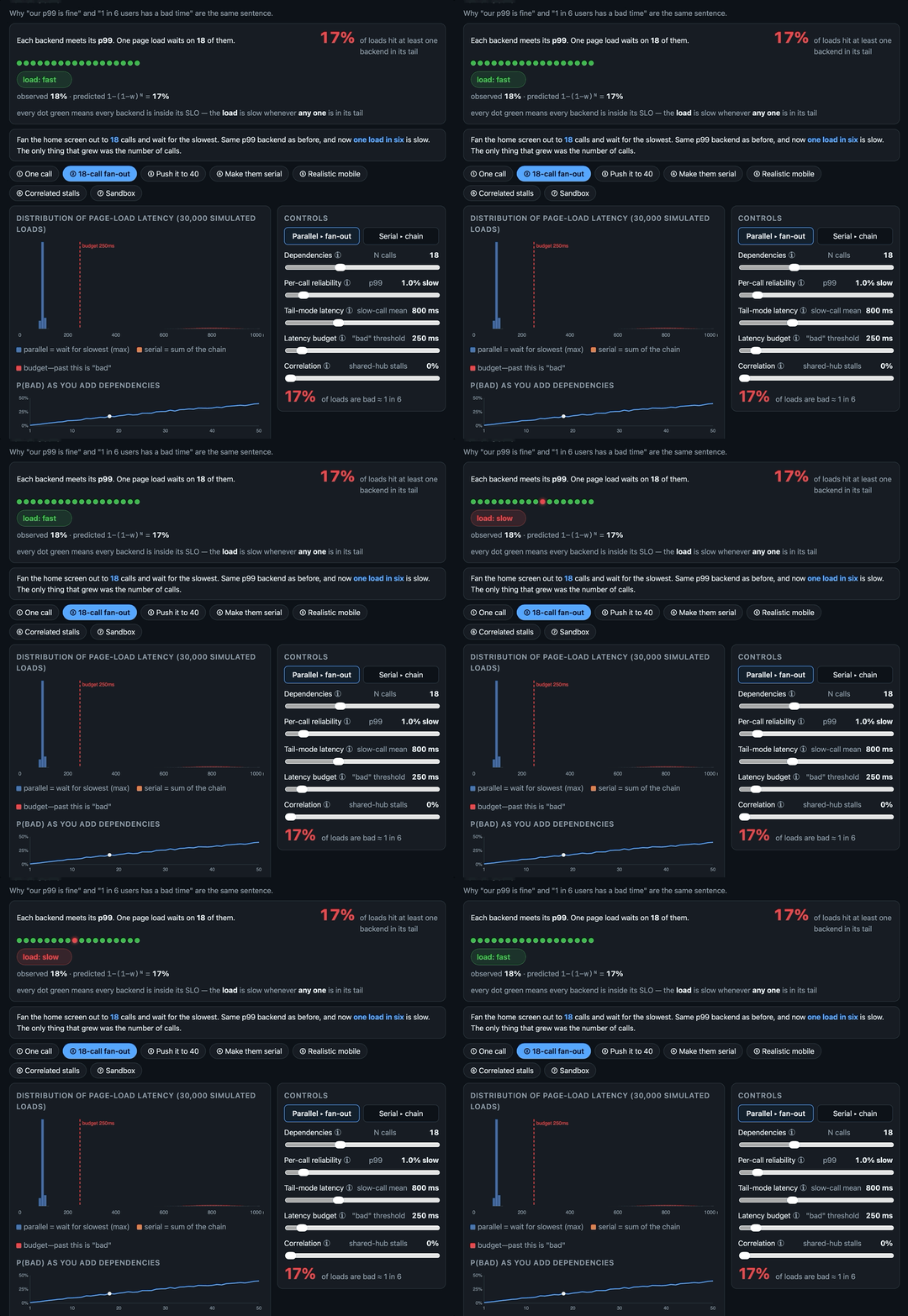
The tail-scale page has a row of dots, one per backend, each green while a call is inside its service target and red when outside. They flicker as the simulation runs, and every so often one returns a tail call and turns red. The result is marked slow whenever any single dot is red. A counter shows how the observed slow rate climbs toward the predicted 1 - (1 - w)^N slow rate.
Eighteen calls at p99 is 1 - (1 - 0.01)^18, or ~0.165, making for one result in six underperforming:
What catches us out isn't the math as much as we tend to reason about latency with an average in our heads and look at service quality on a per service basis, when the average is the wrong summary for the maximum of many draws, and many services contribute to the actual experience in modern internet products.
All systems green
Nothing about any backend is problematic on the face of things: each is still good ninety-nine times in a hundred. Their graphs will be green. Push to forty calls and that rare event ties up a third of the results: 1 - (1 - 0.01)^40, or ~0.331.
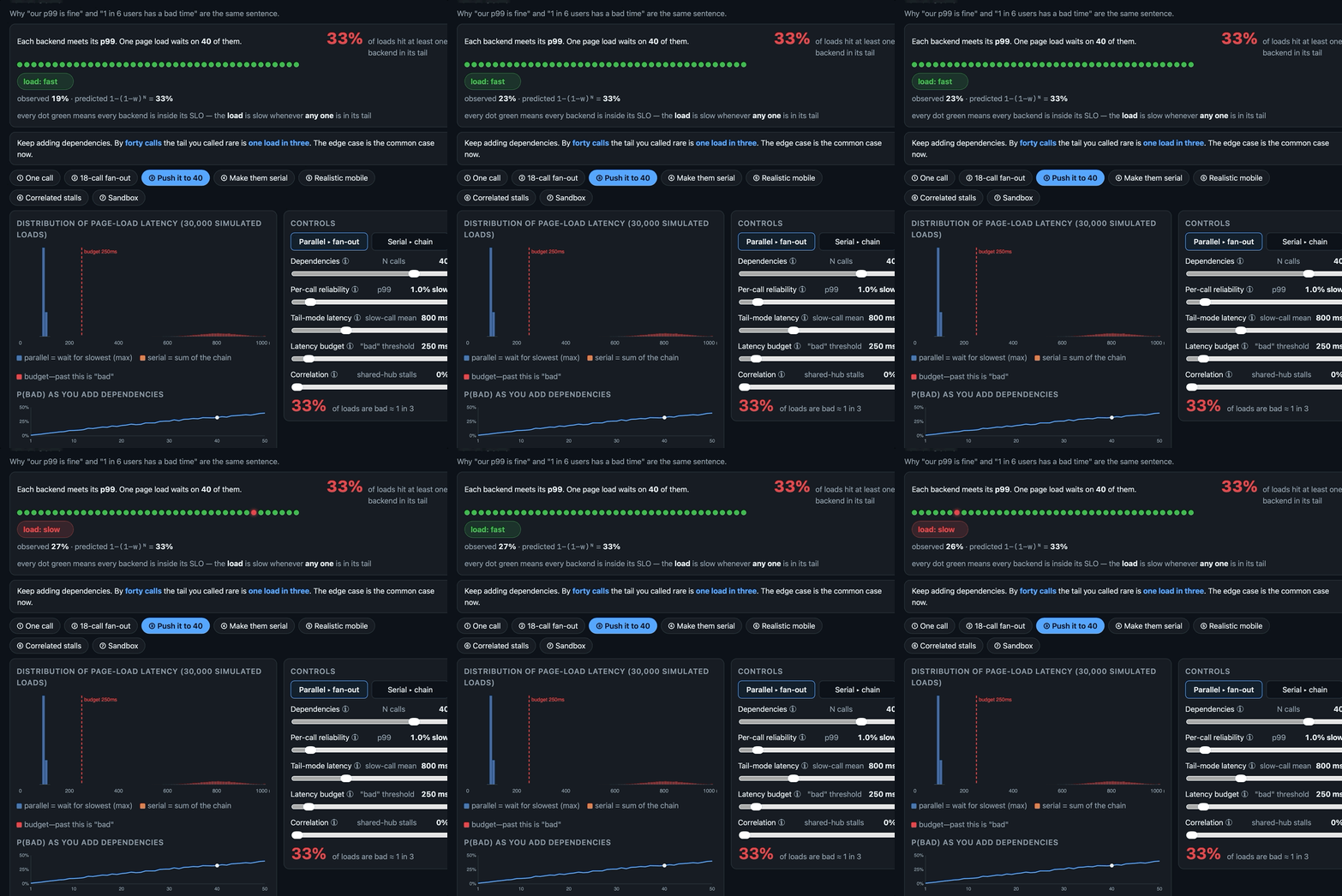
The wide fan out case is brutal: a request touching a hundred backends, each working at p99 means only about 0.99^100, or ~37% of responses are good. A 10-30 fanout is absolutely not unheard of, and while numbers like 40 and 100 might seem excessive, both Google and Amazon have described systems in those ranges. And let’s remember this is happening per client call, so over time a client will have multiple opportunities to experience slowness.
it’s not so much that there’s a distance between ‘every service met its SLO’ and ‘the page was slow’, because both are true at once. More often than not no single team's dashboard monitors the composition of all the teams’ calls. In that sense per-service monitoring is built to show us the first and structurally doesn’t show us the second, because the second appears downstream in the end result.
At swim-two-failures
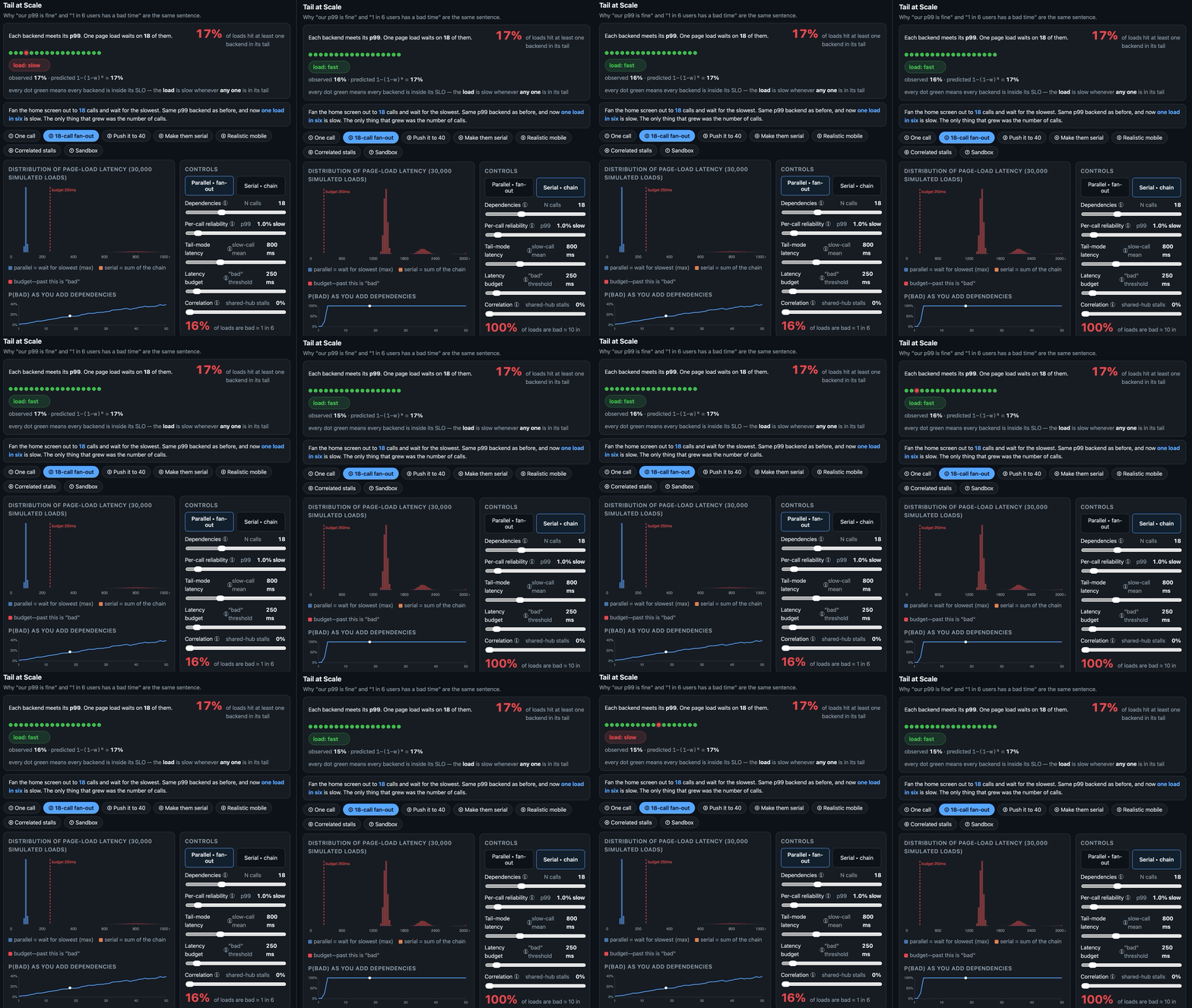
A fan-out and a serial chain fail differently. I got this wrong in my own first swing at the tool so I’m inclined to make a point of it. The bimodal split the tool uses, where parallel fan-out is a max, and a serial chain is a sum, is based on Marc’s post. A fan-out punishes you with variance, a chain with the mean.
A fan-out, waiting on the slowest return, means one unlucky call drags the whole result, so the tail thickens over time. A 1% event becomes more common as our N fanout grows in the 1 − (1 − w)^N slow case.
A dependent-chain sums unlucky calls which means they averaged away, and what breaks the target instead is the mean accumulating. Fifteen calls at a mere 80ms is 1.2 seconds, but that’s well past a 250ms target on the average alone, with no slow call required.
The declaration of interdependence
The (1 − w)^N mode assumes the calls are independent, but in practice they often aren't. A shared cache, a common lock, a GC pause on a service everything touches, a proxy server, a database write lock are all normal things we build on. When they stall or become contended, they impair the whole fan-out or head of line multiple serial calls. And so tail-scale adds a correlation slider. Turn the correlation factor up and the tail fattens past the independent line. The fixes we tend to reach for in service design lean on independence and decoupling, very desirable design goals, but not always the reality of production systems. The correlation slider lets us model what happens when things are occasionally interdependent.
That said, there are options that help with this. One is a request hedging, outlined by Dean and Barroso. You fire a backup request at another replica after the first misses a timing target. This is likely why gRPC has client side call deadlining. That drops the tail from w to w², so a 1% miss becomes 0.01%, but only if the two tries fail independently. If both are waiting on the same contention, that w² goes back to w, and you've added load to the elemtn that's already loaded. Another is the power of two random choices (Mitzenmacher, Richa and Sitaraman). Two choices stops you creating or amplifying a hot spot at all, but you need two real choices to pick between. Adjusting the correlated slider lets you see how severe interdependence can be. The takeaway is, we can engineer around an independent tail (retry it, hedge it), but we have to design around a correlated one (remove the shared dependency, spread the load).
For whom the tail tolls
Percentiles describe a service but our users experience the composition of many calls and tail-scale is a way to intuit the difference between those two. That said this is not a capacity planner. For example, each call is a mixture of two Gaussians to create a bimodal, a fast mode and a heavy tail mode, which is not how real systems work. Real latency is multi-modal, a point Marc makes in his post.
References
Marc Brooker, 2021,Tail Latency Might Matter More Than You Think.
Jeffrey Dean, Luiz André Barroso, 2013, The Tail at Scale.
Michael Mitzenmacher, Andréa W. Richa, Ramesh Sitaraman, 2000, The Power of Two Random Choices: A Survey of Techniques and Results.